How To Make a Good Logo: 5 Logo Design Tips
According to Embryo statistics, 73% of respondents prioritize buying from brands they know. Of which, up to 75% identify a business through its logo design. The figures show how influential logo design is to a brand's business performance!
Therefore, it is not surprising that big brands like Pepsi (2008) or BBC (2021) are willing to spend $1,000,000 and $1,800,000, respectively, to change their logo design.
Of course, a successful logo design does not depend on its price, but on the combination of many different factors! In the past, Nike only spent about $35 to get its legendary "Swoosh" design.
So, how to make a good logo? Let's learn with Mosyne 5 logo design tips to make a beautiful logo and conquer customers absolutely below!
Why is a Logo Important for Your Brand?
A logo affirms the trust and brand reputation of customers in the business. More specifically, the logo helps users quickly identify the brand.
Identify the Products/Services that the Business Provides
In addition to helping identify the brand, a beautiful logo design also shows the orientation of the business's customer base, whether it is luxurious or popular, through the use of colors, stylized fonts, and images.
Logos Support Businesses in Positioning Their Brand
Logos always appear on all media publications, as well as on product packaging that businesses provide. We can see them from brochures, flyers, advertising posts on Facebook, to signs, standees, product packaging, and even in emails, documents sent to customers, partners, etc. Thanks to the frequency of continuous appearance, the logo is gradually engraved in the minds of customers, thereby helping customers remember the business, making brand positioning simpler.
Increase Sales Efficiency
When customers are impressed with a business's logo, it means that they have somewhat placed their trust in that business. Moreover, we often tend to buy products with familiar logos; the more people know the logo, the greater the sales advantage it will have.
Logo Design Strategies to Build a Strong Brand Identity
In essence, the responsibility of a logo is not to tell a complete story about the brand or directly sell products. A logo is considered well-designed when it completes the task of reflecting and conveying the core values of the business or founder.
Logo designs can be classified into two main strategies: complex and simple.
Complex Logo
Complex logos are often built with many complex details and elements. To design a complex logo, the main job is not only to combine design elements such as images, colors, text, but also the art of placing and synthesizing each element. It helps the brand to comprehensively convey its context, history, and multidimensionality.
Typically, complex logos are often associated with elements such as time (such as the year of establishment), historical context, or business sector. They have the power to bring uniqueness and depth to the brand.
Some typical examples of complex design include:
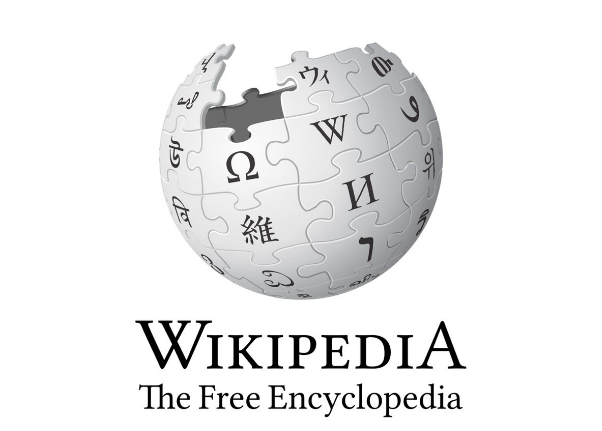
Wikipedia: The logo is shaped like a globe assembled from individual pieces. It reflects the mission of disseminating diverse knowledge and conveying the message of joint contributions from a large user community.

Nestlé: The logo features an image of a mother bird caring for two baby birds, symbolizing family ties. Over the years, although it has been refined to suit modern aesthetics, the logo design still retains elements of traditional heritage.
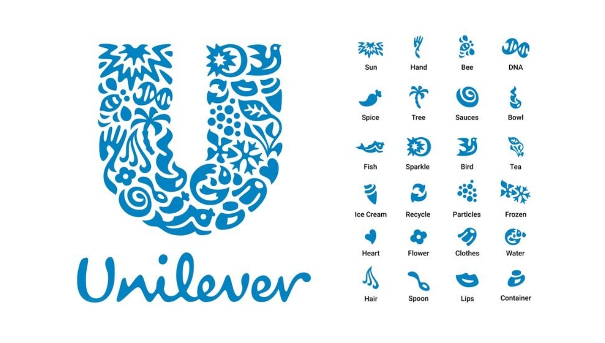
Unilever: The logo is a “U” shape made up of 25 different icons, each with a separate meaning. For example, the “flower” icon represents fragrance, reminiscent of OMO detergent, Comfort fabric softener, etc., or the “hair” icon represents TRESemmé and Lifebuoy shampoos, etc.
Simplicism
The simple logo focuses on creating clean and memorable icons. Although there are only a few elements, a simple logo has the ability to communicate strongly and is easily recognizable, helping the brand stand out from the crowd. In addition, the flexibility of a simple logo also allows the brand to use it on many platforms, with different requirements for size, color, and material.
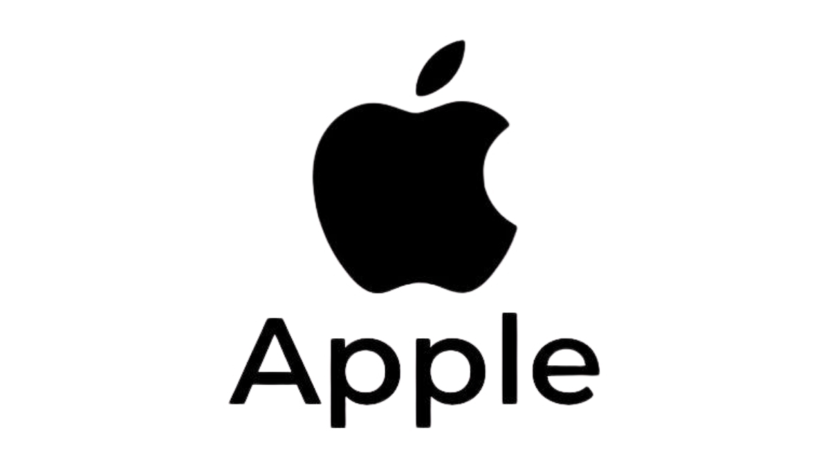
Now, the simple logo is becoming a popular logo design trend. Many brands have taken the time to simplify their brand identity and logo. A typical example is Apple, from an initial logo version that seemed “bulky”, Steve Jobs sought out Rob Janoff to create an iconic logo with the image of a “bitten apple”.
Ivan Chermayeff, one of the best graphic designers of the 20th century, once said: “The logo design process usually takes 2 months, but it should look like it was done in 5 minutes.” Coincidentally, Janoff also has the same opinion. He believes that the most important thing in a logo is simplicity, and long lists of elements that need to be included in a logo are a recipe for failure!
Should I Choose a Complex or Simple Logo Design?
Although simple logo designs are becoming more popular, this does not mean that choosing a complex design will lead to failure. Sometimes, complexity in logo design will bring its own benefits to your brand. The final decision will depend on many different factors, such as the development direction of the business, the market context, as well as the target audience.
For the same product, logos can be completely different based on the founder's approach and vision. This is often noted in the logo design brief. For example, Nike did not want their logo to be just a symbol of a shoe company; instead, they wanted their brand to celebrate the values of speed and power. Therefore, the logo was designed in a simple style with the “swoosh” symbol. And later, it effectively supported the marketing campaigns, together conveying the values of speed and power.
In the table below, Mosyne will review some of the different strengths and weaknesses of these 2 strategies of logo design!
Complex logo design | Simple logo design |
Easily attract attention. | Easy to recognize, easy to remember. |
Effectively convey brand meaning/context. | Easy to increase/decrease in size, suitable for many uses. |
Can be confusing to viewers. | Can look a bit “monotonous”. |
Details are blurred when reduced in size. | It's hard to differentiate from other designs. |
5 Tips for Designing a Standout Brand Logo

The criteria for determining a quality logo design do not stop at aesthetic values. It is a combination of many factors, requiring meticulous research on both brand identity and the psychological impacts that each design element brings.
In this section, Mosyne will suggest some logo design tips related to the above factors, helping you optimize the effectiveness of the design process.
Note: The tips below are closely related to each other! So, remember and apply them at the same time to achieve the best results. Let's explore!
Research the Brand and Users
Before coming up with ideas for a company Logo design, you need to have a deep understanding of the brand identity, as well as the target audience that the company is aiming for. At this step, you need to pay attention to several aspects, including:
What is the meaning or story behind the brand name?
What is the brand's personality?
Who is the brand's target customer?
What emotions does the brand want to evoke in customers?
From this information, you can determine the appropriate logo style, typography, and color palette when sketching out design ideas.
Understand the Strengths and Weaknesses of Each Logo Type
You can see that there are countless different logo types on the market today. Each type will have its strengths and weaknesses, as well as specific use cases. Knowing this information will help you save time when coming up with ideas and make design choices that suit your company's needs.
Master the Knowledge of Color and Shape Psychology
Color and shape have a significant impact on human perception. This has been proven through many previous studies. Therefore, mastering the psychology of color and shape will help you choose the right "elements" to evoke the right emotions in users.
If you design logos for customers, mastering this knowledge will make your design presentation powerful, winning their trust. As Paul Rand, known as the "Godfather" of logo design, once said: "Presentation is key!". Presentation ability is the key to creating a successful corporate logo design.
Sketch More Than One Idea
Unless you are Paul Rand, who got Steve Jobs' approval on the logo design for the "Next" brand with only one idea and one edit. It is difficult to convince your client of your idea if you only give them a single sketch.
Instead, based on your understanding of the brand, you need to come up with ideas for many different sketches. Then, choose the 3 best ideas to present to the client. Depending on the client's choice and feedback, you will continue to develop the sketch into a complete version.
Evaluate the Logo Design
After completing the design, evaluating the logo will help you know whether the design meets the requirements or not. One of the most popular ways to evaluate is Paul Rand's 7 steps to evaluate the Logo:
Distinctive: Is the logo different and recognizable compared to competitors?
Visible: Is the logo easy to see and recognize at all sizes?
Adaptable: Is the logo flexible and suitable for many different platforms and media?
Memorable: Is the logo easy to recall every time customers encounter the brand name?
Universal: Is the logo relevant and understandable to a global audience?
Timeless: Does the logo remain relevant over time?
Simple: Is the logo simple and uncluttered?
Rate your logo design based on the steps above and use a scale of 1-10 for the first 6 steps, and a scale of 1-15 for the last step. The maximum total score is 75, and to meet the requirements, the design needs to score 60 or more.
Of course, we cannot apply this method to complex designs! Therefore, you can conduct a survey of the user audience according to some “metrics” such as:
Appeal: Does the logo attract and make a positive impression on you?
Believability: Does the logo make you feel the brand is trustworthy?
Ease of identifying: Is the logo easily recognizable and distinguishable?
Purchase intent: Does the logo motivate you to buy the brand’s products or services?
Relevance: Is the logo appropriate and related to the brand’s products or services?
Uniqueness: Is the logo unique and different from other brands?
From here, you can choose the “metrics” that are suitable for the brand’s goals and proceed to build a survey questionnaire. A commonly applied question type is the Likert scale.
For example, you can ask: “How is the logo design different from other logos?” and give some options such as:
Not different at all
Not too different
Slightly different
Very different
Extremely different
Examples of Beautiful Brand Logo Designs
To be able to have diverse and suitable ideas, you need a rich source of references to draw from your own experience. Below are beautiful and outstanding logo designs that Mosyne synthesizes to help you have a more multi-dimensional view.
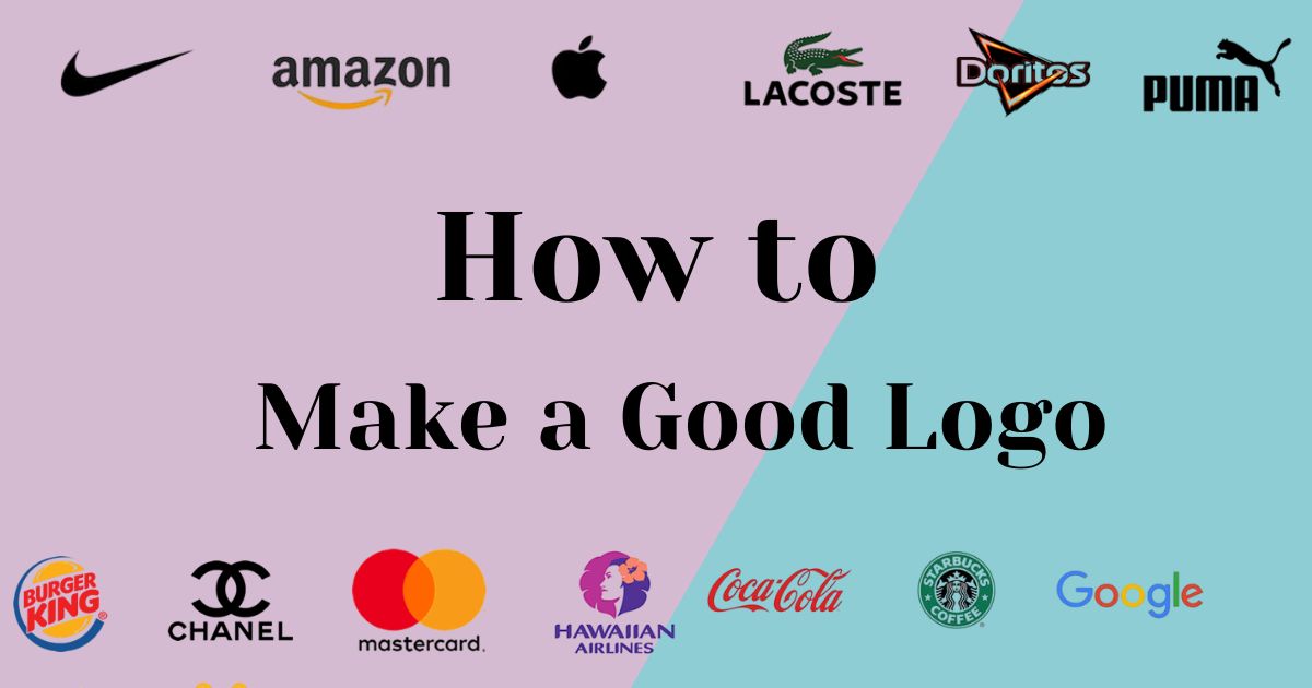
Coca Cola
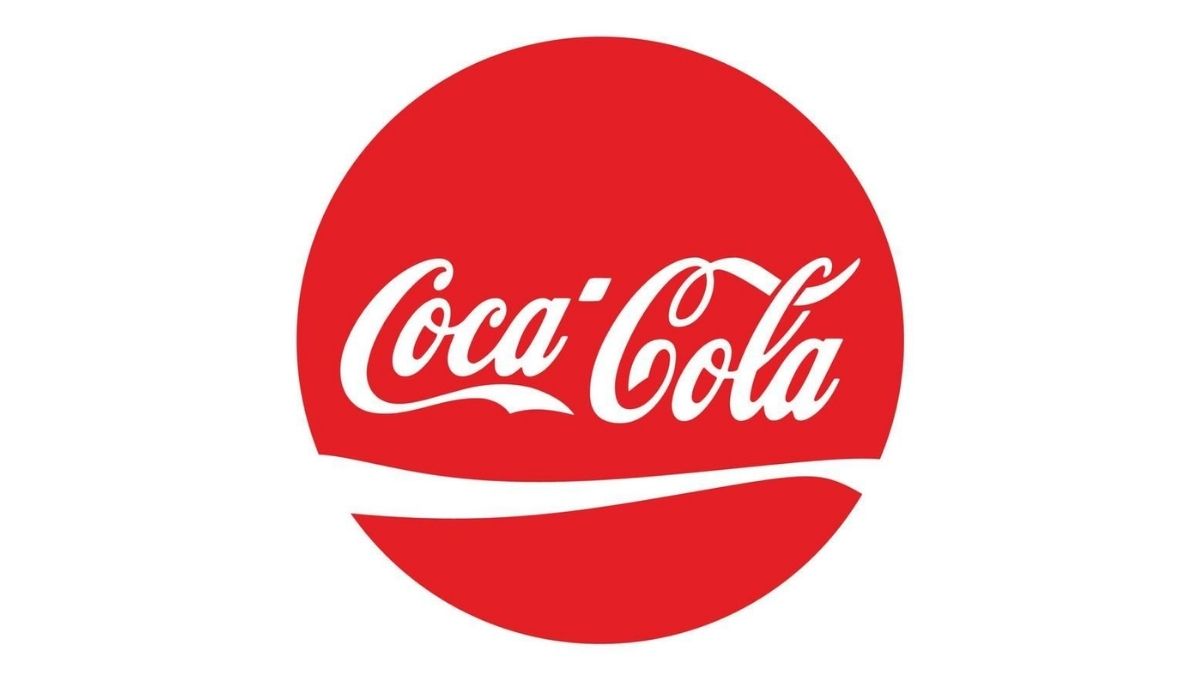
Overall, the Coca-Cola logo is designed quite simply with a curvy font. It is brilliant with colors and stimulates the taste buds.
Starbucks
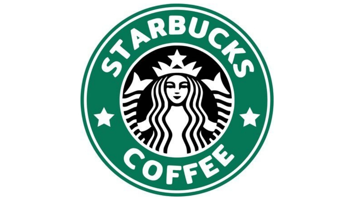
The Starbucks logo is a twin-tailed mermaid, or siren. It is a creature from Greek mythology known for luring sailors with her voice.
Amazon
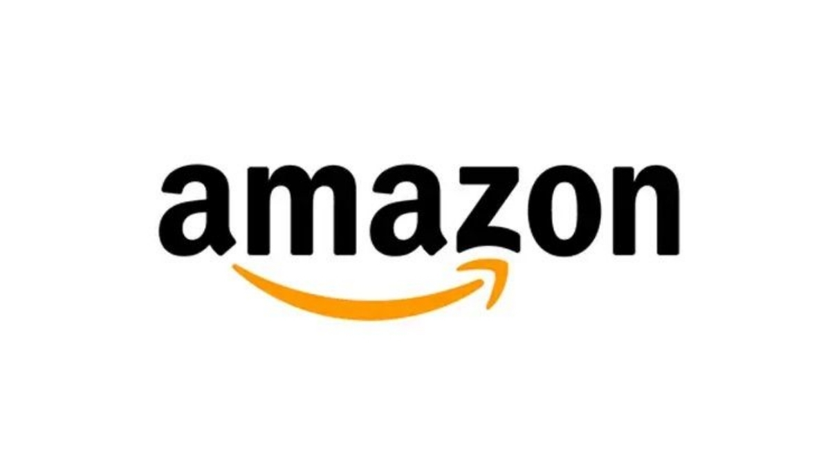
Amazon is the world's leading e-commerce channel. The arrow starts from "A" and ends at "Z" meaning that Amazon will provide you from A to Z. If you pay a little attention, you will notice that the arrow starts from the letter A and ends at the letter Z, designed as a special smile.
The world's largest search engine, Google, has a simple letter logo design but is painted with unique colors.
Nike
Nike is considered the most famous brand in the sports world. When it was founded, Phil Knight - the owner of this brand, determined the goal in mind: to design a simple logo but show the element related to speed.
Conclusion
A truly quality logo design will be the result of a painstaking research and design process. Hope you know how to make a good logo. Mastering the above logo design tips will help you optimize your time and effort, as well as make choices that suit your brand's requirements.