What is the Golden Ratio in Logos? A Guide for Creatives
The golden ratio is the immutable rule in logo design. This rule is always of special interest to designers. Scientifically, the golden ratio is tied to the way we perceive beauty.
This blog shows you what is the golden ratio in logos. You will know how this age-old formula can create logos that are not only iconic but also rooted in science as old as nature itself. Let's get started.
What is the Golden Ratio?
The golden ratio (Golden Rule, Golden Section, Golden Mean, Divine Proportion, or Greek letter Phi) is a mathematical ratio found in nature. When used in design, the golden ratio creates natural aesthetic layouts to make the eyes look more comfortable.
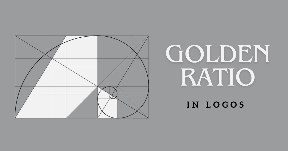
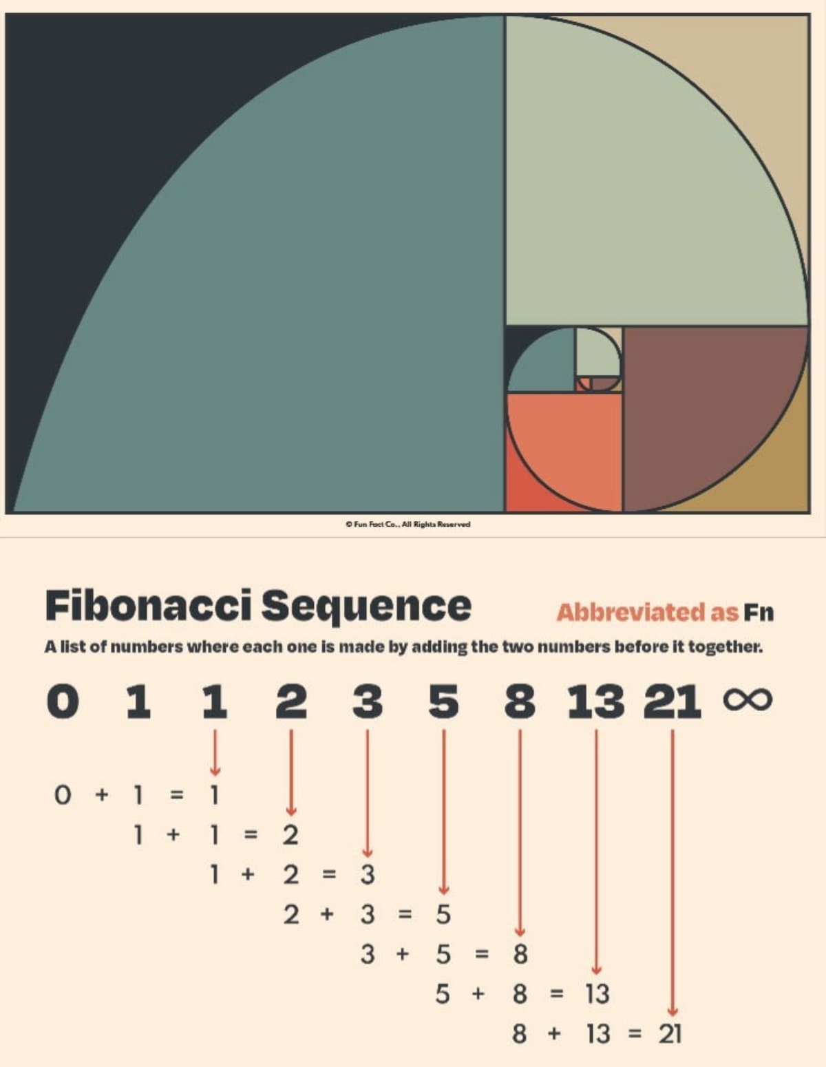
The golden ratio is based on the number Phi (φ) = 1.61803398874… proposed by the Italian mathematician Fibonacci. Phi (φ) is the ratio between the series of numbers 1, 1, 2, 3, 5, 8, 13, 21, in which the next number in the series is equal to the sum of the previous two numbers.
For example: 1+1=2, 1+2=3, 2+3=5...
When we divide the consecutive numbers into proportions, for example, 5/3 = 1.67 and 21/13 = 1.615. This ratio approaches the number φ (1.618).
The golden ratio is applied in architectural, sculptural, and fine arts design works. This rule is a tool to create perfect, beautiful designs. Evidence of ancient architectural works is the Parthenon Temple, the Khafre Pyramid, or the painting of Monalisa by artist Leonardo Da Vinci.
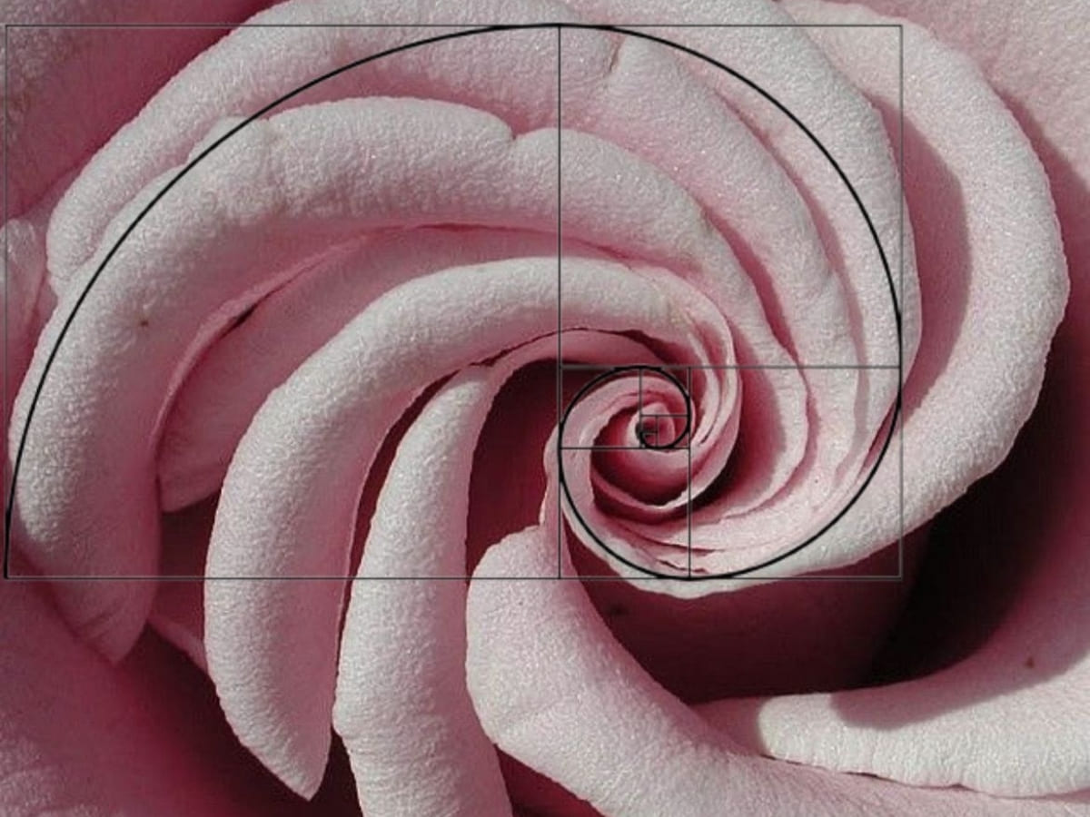
The golden ratio appears in nature around us, and for design, the golden ratio helps bring unexpected effects to the image. It brings perfection, harmony, and balance to the designs. That is why designers attach great importance to this principle to bring aesthetic values to logo or website designs.
The Golden Ratio in Nature
Ancient scientists have deeply studied the ratio of the edges and blocks of shapes such as squares, rectangles, triangles.
During the Egyptian period, construction works also had ratios that surprised scientists with their accuracy. Most structures are large in size, but the proportions do not change. This creates a lasting beauty for the structure. Through careful evaluation of size and proportion, scientists have realized that these proportions are highly effective.
The beauty of nature and creation is a beauty that everyone recognizes, but few people know that this beauty is due to proportion and natural balance. In 1860, a German physicist and psychologist named Gustav Theodor Fechner proposed a simple proportion that defines the balance of nature, called the golden ratio.
Fechner conducted a simple experiment: 10 rectangles with different length-to-width ratios were placed in front of the respondents. Most of the shapes people chose had a ratio of 1.618. That is the golden ratio.
Why is It Important to Follow the Golden Ratio in Logo Designs?
There are reasons why designers often have to follow the golden ratio in logo designs. The principles are mainly aimed at creating aesthetics, uniqueness, comfort, ease of sight, and are also extremely useful in transforming later versions of the logo.
Creating Aesthetic Balance and Harmony for Logo Design
When applying the golden ratio in logo design, the designs will be balanced, natural, pleasing to the eye, creating a better impression on people. Such designs have the ability to attract more natural attention.
Creating “Visual Satisfaction”
“Visual satisfaction” is a phrase that clearly shows the effectiveness that the golden ratio in logo design brings to each design. It is a comfortable, soothing feeling every time customers look at any logo designed according to the golden ratio. This factor contributes to creating a good first impression for the brand, a stepping stone for customers to continue to learn about you or pay attention to other brands.
Unifying the General Ratio Each Time the Logo is Edited
The logo template can be flexibly edited according to each development period of each brand, but the layout and general ratio are still retained. This is due to the application of the golden ratio in logo design, so even if there are changes, later versions of the logo will still maintain the balance and harmony of the original.
How to Apply the Golden Ratio in Logo Design?
![]()
Using the golden ratio in logo design makes the logo look balanced, harmonious, and pleasing to the viewer's eyes. At first, applying this ratio technique may take a lot of time to calculate and practice. But once you get used to it, you will have experience. You can immediately recognize the unstable elements in the design and fix them more easily.
Use the golden ratio in logo design in two ways: the golden ratio spiral or using the Phi block (Fibonacci).
Apply the golden ratio to design elements such as:
Examples of the Golden Ratio in The Logo Design of Big Brands
Take a closer look at how some of the world’s most recognizable brands have applied the golden ratio in their logo designs.
Golden Ratio in Apple Logo Design
![]()
Apple is a typical example of applying the golden ratio in logo design. Apple's logo is a bitten apple - showing the imperfection in everything in life. This reminds everyone to always try, try harder to be more perfect.
The logo is simple, but meaningful, unique, and easy to remember. It helps this symbol become a separate brand, engraved more deeply in the minds of customers.
Pepsi Logo Design
![]()
The golden ratio of the Pepsi logo is two main circles with a diameter ratio of 1.618. The logo looks quite similar to a smiley face, motivating everyone. But going deeper into the design analysis, this logo completely follows the golden ratio. This makes it more attractive and impressive, creating a famous, memorable brand.
Golden Ratio in iCloud Logo Design
![]()
The iCloud logo is quite impressive. The curves that create the cloud also have a diameter according to the golden ratio. The rectangle outside the logo also has a golden ratio.
Toyota Logo Design
![]()
Toyota's logo is also an example of applying the golden ratio in logo design, but it is a bit more complicated than the above logos. The logo consists of three ovals, one large one containing two small ones, intersecting both horizontally and vertically. The intersection of these two ovals has applied the golden ratio in the design.
Golden Ratio in BP Logo Design
![]()
The BP logo is also another example of applying the golden ratio in a circle. The ratio of the radius of this circle is equal to the number Phi, according to the golden ratio.
Google Logo Design
![]()
Although the Google logo combines many colors, they are very harmonious with each other. They applied the golden ratio principle to their logo. The diameter of the circles follows the golden ratio of 1.618.
Conclusion
We know that the golden ratio in logo design plays an extremely important role in creating an aesthetic, impressive, and unique logo. But in reality, not all designers know how to apply them to achieve high efficiency in their work. There are good designers who do not let their creativity be limited by any rules. Therefore, let's turn the available tools to support you in creating a perfect product in a flexible and skillful way.