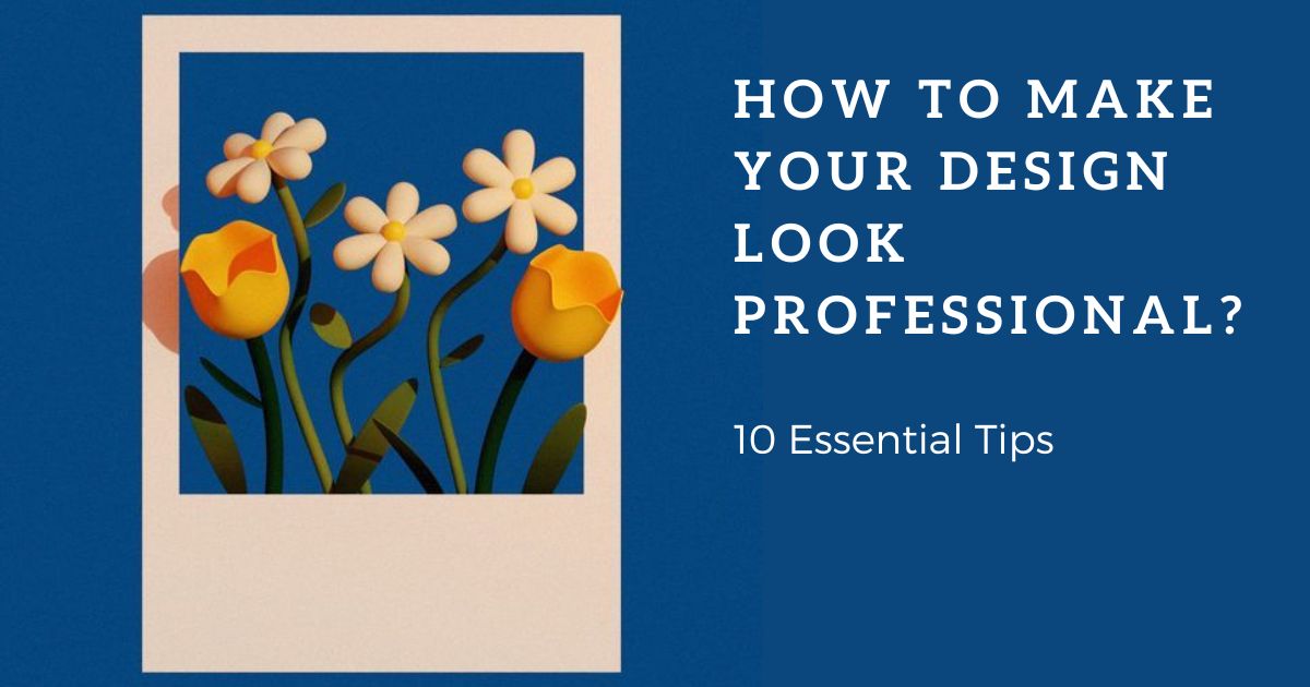
How to Make Your Design Look Professional: 10 Essential Tips
The difference between amateur and professional often comes down to a few small but powerful details. It really matters. According to an Adobe study, 73% of consumers say design influences their perception of a brand’s credibility, and 94% of first impressions are based entirely on visual design. That means your visuals are your first handshake, your voice to customers.
But how to make your design look professional? You don’t need a degree in graphic design to level up your work. With the right tools, a few design principles, and a bit of practice, anyone can create visuals that feel cohesive, clean, and compelling.
In this blog, we’ll walk you through 10 essential tips that will make your design look professional. These are strategies backed by research and best practices used by professionals across the creative industry.
1. Start with a Clear Visual Hierarchy
Ever looked at a design and felt instantly drawn in, like your eyes just knew where to go first? That’s how visual hierarchy is at work. It’s one of the most important (and overlooked) elements in design. It can make or break how your message is received.
Visual hierarchy is rooted in how our brains process information. A 2006 study published in Behaviour & Information Technology found that users form an opinion about your design in just 50 milliseconds. So, your layout has to be instantly clear, or you’ve already lost potential customers.
“Our brains are wired to scan for order,” explains Dr. Susan Weinschenk, behavioral psychologist and author of 100 Things Every Designer Needs to Know About People. “We look for patterns — big things first, then smaller details. If your design doesn’t reflect that natural flow, it creates friction.”
So, how do you create that natural flow?
Start by prioritizing your content. What do you want your audience to see first? That’s usually a bold heading, eye-catching image, or strong call to action. Make that element larger, bolder, or brighter than everything else.
Some quick tips backed by design science:
Size = importance: Larger elements naturally draw more attention.
Color contrast increases focus: High-contrast colors improve readability and guide the eye.
Position matters: According to the “F-pattern” reading behavior identified by Nielsen Norman Group, viewers tend to scan content top-to-bottom, left-to-right. Use that to your advantage by placing key info in those zones.
2. Use Consistent Fonts and Sizes
Just like tone of voice in writing, fonts carry personality. If you’ve got five different voices shouting at once, it’s hard for anyone to know what to focus on.
“Pick two fonts: one for headings, one for body text, and stick to them like glue,” says branding expert Kira Hyde. “That simple rule alone can instantly level up your entire brand presence.”
If you're not sure where to start, you can go for contrast with a purpose. Pair a serif (like Playfair Display) for your headings with a clean sans serif (like Montserrat or Open Sans) for your body copy. Just avoid extremes, like combining an ultra-bold graffiti font with delicate cursive. That’s not contrast, that’s conflict.
Eye-tracking studies show that users spend more time engaging with designs that use clear, readable type, especially when text size and spacing follow predictable patterns.
Speaking of size, your font hierarchy should mirror your content hierarchy. Use larger sizes for headings, medium for subheadings, and small for body text. Try the 1.6x rule (also known as the golden ratio of typography). If your body text is 16px, try 26px for headings and 10px for captions. It feels natural to the eye and makes scanning easy.
3. Mind the Spacing
Spacing, also called white space or negative space, might seem like a background detail. But it’s actually one of the most powerful tools in your design kit. It’s what makes things feel clean, professional, and easy to digest.
Line spacing (or line-height) of 1.4–1.6 times the font size generally makes text easier to read. That’s backed by typographic research from the University of Reading.
Space isn’t wasted. In fact, minimalist designs with more white space often feel more modern and premium. Think Apple ads or luxury brand websites, they’re practically 50% whitespace.
4. Align Everything

When content follows a clear structure, the brain spends less energy figuring out where to look and more on what your message is.
Let's pick a baseline: left, center, or right, and be consistent with it. A quick tip for you is to zoom out and squint at your design. If your layout feels balanced and easy to follow even when blurry, your alignment’s probably working.
In the end, alignment isn’t about making things rigid. It’s about creating an intentional structure, so your message comes through clearly and beautifully.
5. Limit Your Color Palette

We know playing with color is one of the most exciting parts of design. With hundreds of shades and hues at your fingertips, it’s easy to want to use them all. However, when creating a design that feels professional, less is almost always prioritized.
When your palette is curated and intentional, the eye knows exactly where to go. This is backed by research as well, studies in visual cognition and design psychology have shown that simplified color schemes improve readability, comprehension by reducing what is called “visual noise.” One study published in the Journal of Human-Computer Interaction even found that users processed information faster when presented with low-complexity color layouts.
So, what does a limited palette actually look like in practice? Typically, you’ll want to stick with two to three core colors. Start by choosing a dominant color. This is the main color that reflects your brand or message. Then, add one or two accent colors to create contrast and highlight important elements, like buttons, headings, or icons. Finally, use a neutral tone (such as white, black, gray, or beige) to bring balance and help your main colors stand out.
6. Use High-Quality Images and Icons

High-quality images instantly elevate your work, adding professionalism and clarity in a way that text alone can’t achieve. Moreover, visual design (including image quality) is one of the top factors influencing whether users believe a website or brand is credible.
When choosing images or icons, prioritize resolution and relevance. As a rule of thumb, your images should be at least 1MB in size to avoid visible pixelation (logos can be smaller, around 500KB since they’re often simpler). If you’re resizing, always drag from the corners to maintain proportions. Stretching an image sideways is a fast way to ruin its quality.
Beyond quality, your images and icons should match your brand’s tone and style. If your design is minimal and modern, overly playful or cartoony graphics will feel out of place. Stick with icons and photos that share a similar color scheme, lighting style, or visual mood. It creates cohesion across your design, even when the individual elements are different.
7. Stick to One Visual Style
Mixing too many visual styles in your design can feel jarring and inconsistent. A unified style makes your audience instantly understand your tone, your brand, and your message. If one image is hyper-realistic, another is a flat cartoon, and a third uses vintage filters, the viewer may be left confused, and confused people tend to click away.
Consistency doesn’t mean everything has to be identical, but it should all live in the same visual “universe.” For example, if you choose hand-drawn icons, carry that look through all your visuals. If your photos are warm-toned and moody, don’t suddenly throw in something bright and clinical.
Sticking to one visual style also supports branding. Think of the brands you love most. You can probably picture their style instantly: minimalist, playful, retro, or bold. That’s consistency in action.
8. Watch the Details
Sometimes it’s the smallest things that make the biggest difference. A misplaced icon, a typo in your headline, or slightly misaligned text can take an otherwise polished design and make it feel off. That’s why watching the details is a crucial step if you want your design to look truly professional.
The human brain is surprisingly sensitive to visual inconsistencies. We might not always be able to point out what’s wrong, but we feel it. That tiny sense of imbalance can undermine the trust you’re trying to build with your audience.
Start by checking your spelling and grammar; always attend to them. A beautiful layout won’t save a typo-riddled headline. Next, zoom in and scan your spacing. Are your margins even? Are text boxes aligned properly? Do elements have enough breathing room? If something feels too close or too far, trust your eye and fix it.
Also, take a second look at your icons and visuals. Are they all the same style and size? Are your buttons evenly spaced? Did you accidentally leave a shadow effect on one image but not the others? Catching them needs care, effort, and professionalism.
One trick designers use is to step away from their work and come back with fresh eyes. Or even better, get a second opinion. Maybe all it takes is a friend to point out the one detail you’ve been overlooking for hours.
9. Design for the Medium
A design that looks stunning on Instagram might fall flat in a printed brochure and vice versa. That’s why you need to design with your specific medium in mind.
Think about how people will interact with your design. If it’s on a phone screen, it needs to be legible at a glance, with bold text and clear visuals. If it’s a poster or flyer, you have more space to play with layout and fine detail. You’ll need high-resolution files so it prints cleanly and crisply. Designing for email demands small file sizes that load quickly, plus clickable buttons that are easy to tap on mobile.
It’s also important to consider format and scale. For example, colors that look vibrant on screen may print differently due to variations in ink and paper. Fonts that are legible on a desktop might feel too small when viewed on a smartphone. So, always check your work in context before you publish, remember to preview it on the device or in the format it’s meant for.
10. Get Feedback and Iterate

You’ve put time and care into your design, now it’s time to take a step back and invite a fresh perspective. Feedback supports you in spotting things you may have missed, seeing your design through someone else’s eyes, and ultimately refining it into something stronger and more effective.
It can be tempting to skip this step, especially when you feel satisfied with your work. But even the best designers rely on outside input. In design schools and creative agencies, critique is a normal part of the workflow. Why? Because design is communication, and communication only works when your message is clear to others, not just to you.
When seeking feedback, be specific. Ask questions like: “Is anything unclear or hard to read?”, “Does this feel balanced?”, or “What’s the first thing you notice?” That way, you’re guiding your reviewers to give you actionable input instead of vague comments like “It’s nice” or “I don’t know, something feels off.”
Remember, not every piece of feedback needs to be taken. Use your judgment. If three people flag the same issue, it’s worth revisiting. If one person dislikes your font choice but you feel strongly about it, that’s okay, too. You get to make the final call.
Conclusion
Finally, we found the answer to how to make your design look professional. Applying these 10 essential tips, you'll make your designs look better and then communicate with customers more effectively.